

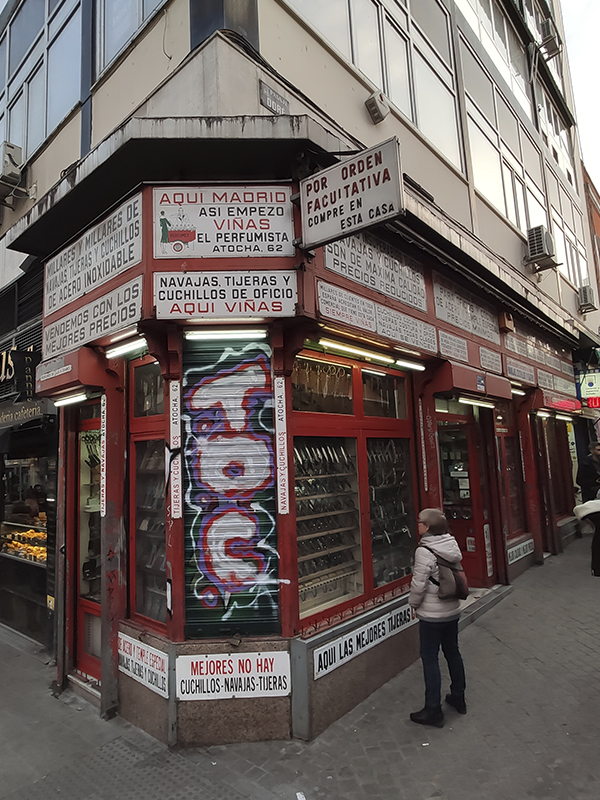
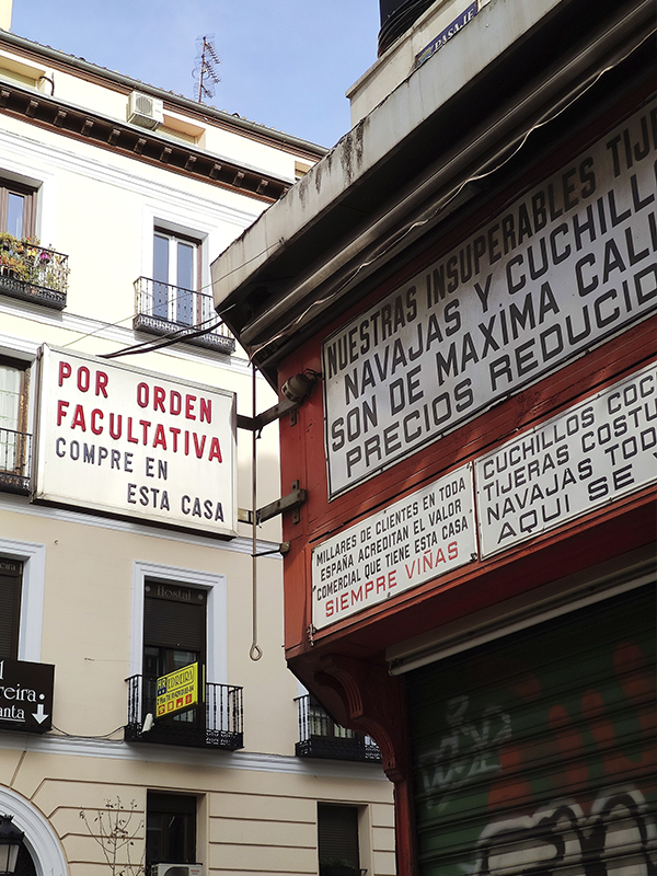
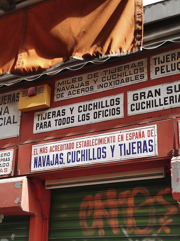
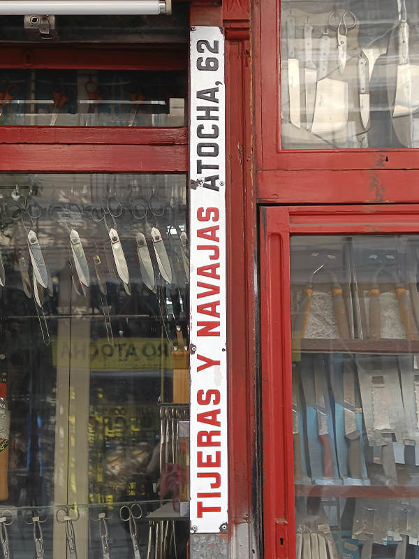
To fit so many messages in so little space, Viñas’ letters are a variable font before variable fonts. From the oldest ones painted on thick, domed, enamelled sheet metal to the most modern ones on a thinner metal plate, they all form part of the same family that adapts its width and thickness to the size of their place in the wall to compose dozens of fantastic advertising slogans.

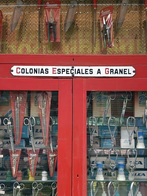
The signs are signed Casa Soto – Madrid and you can still see the pencil lines made by the sign-painter when sketching the work. This horizontal division into five stripes is typical of sign making and has been retained in Atocha 62 font. Punctuation and accents are strange in a sans serif design, especially compared to the tilde of the Ñ, and have been maintained as a stylistic set accessible through an OpenType feature.


With two variable axes, Width and Thickness, Atocha 62 is versatile, expressive and can say anything out loud.

Atocha 62
Styles
Glyphs
OPENTYPE
