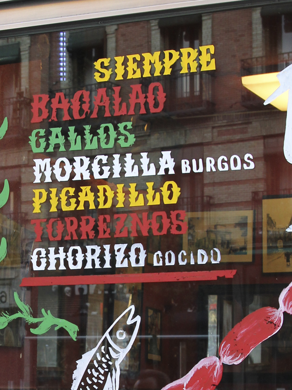
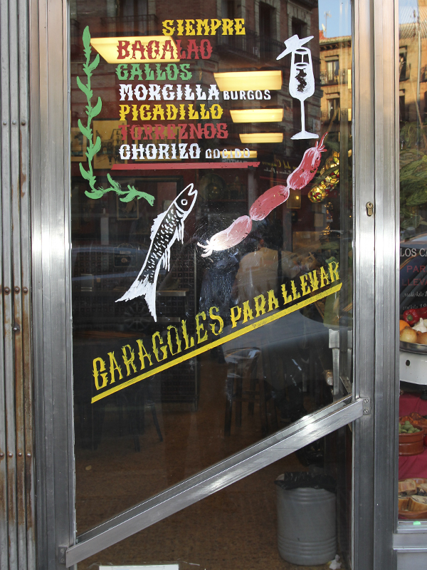
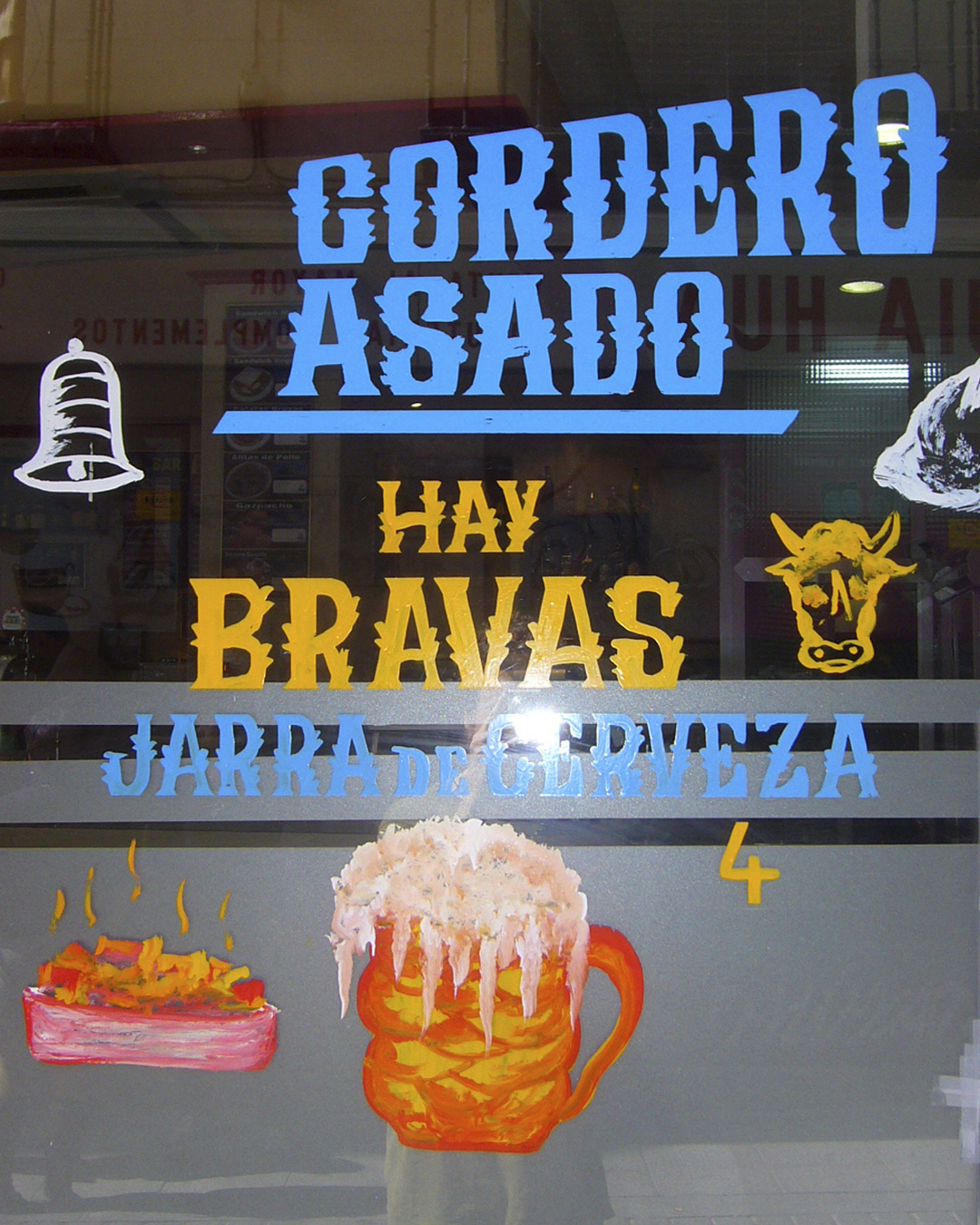
At the end of the 20th century it was no exaggeration to say that half the bars in Madrid had their windows painted with the same strange and unmistakable lettering: a kind of serif with little contrast and strange spikes painted on the windows in basic enamel colours.
I always thought it was a local style, a sign painting trend from Madrid, until I came across this article from the jreat blog Vicisitud y Sordidez and discovered that it wasn’t a style but a person: Tony Encinas. In fact, his signature or a small T.E. can still be seen in the corner of lists of sandwiches and tapas that were originally painted in pesetas. Encinas didn’t seem to be a vocational sign painter, or even to have any interest in learning or improving his craft, and simply found a way to make a living. In a way, it’s very Madrilenian to have your aesthetics depend on someone who doesn’t give a damn, and Encinas became a mythical being for lovers of signs and cholesterol.
As Encinas’s lettering is completely anarchic and impossible (or terrible) to copy straight away, we have allowed ourselves the luxury of reworking it, finding what we think can be saved from his style and improving it, even at the risk of losing the grace along the way. We have even included lowercase letters (something we have never seen in the original) and the possibility of hiding the side spikes to be used where the original is too encinistic. Making your own version of a letter you don’t like has its charm, it was a dirty job but someone had to do it.
Today many of those bars that opened in the 70s and 80s have closed due to retirement, and those that are still open have not stood the test of time or trends. What was once ubiquitous is now rare to see, and soon few people will know where this typeface with the odd sprout on the side comes from.
To name our Encinas we have chosen a sign with a long tradition and which, we hope, will last a long time in its place: that of Los Caracoles on Cascorro Square, an old bar with iron health where MTM foundry holds its shareholders’ meetings.