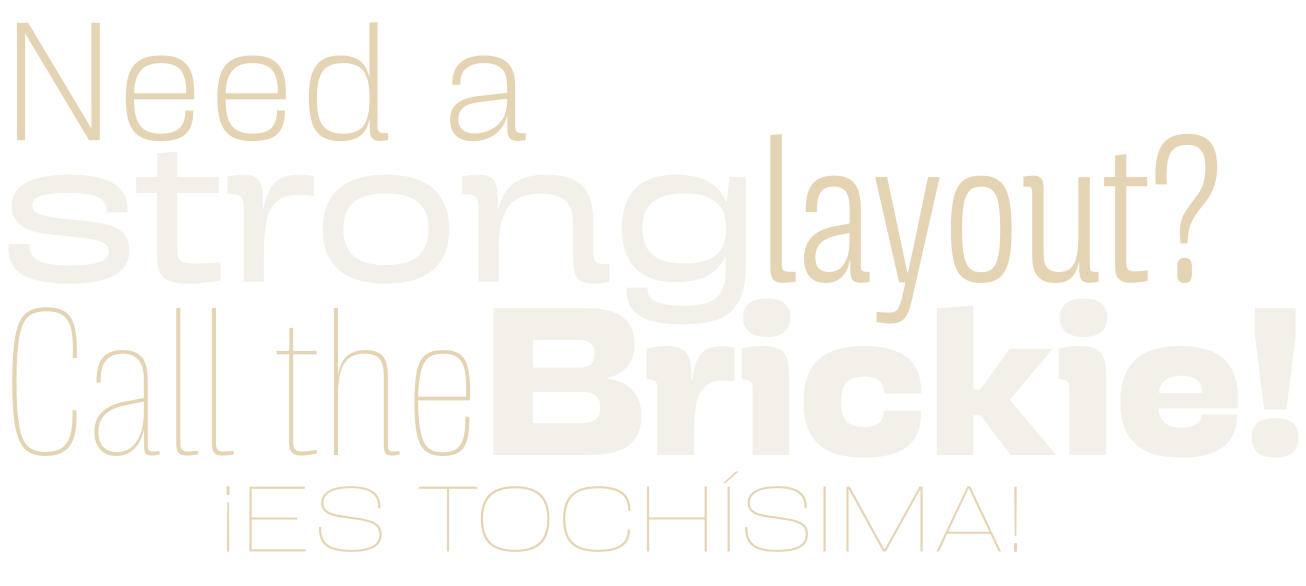
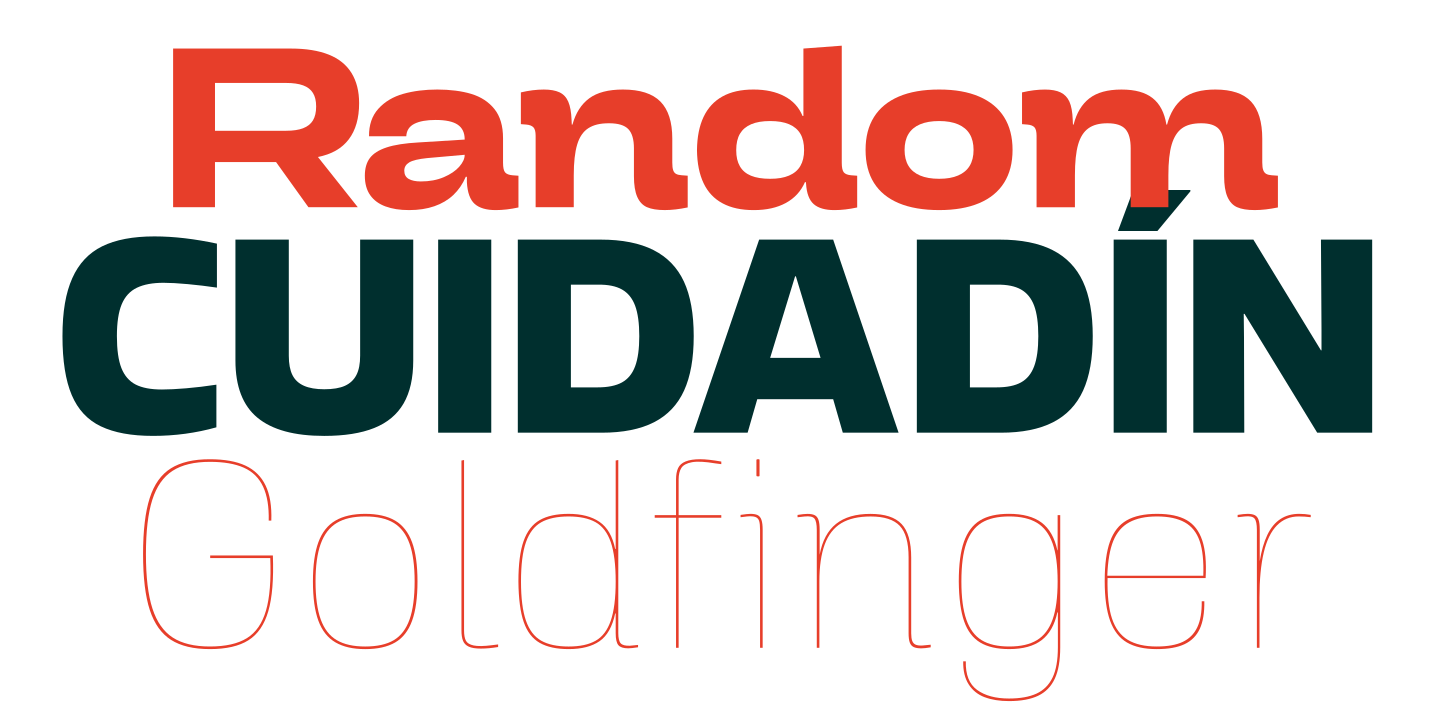
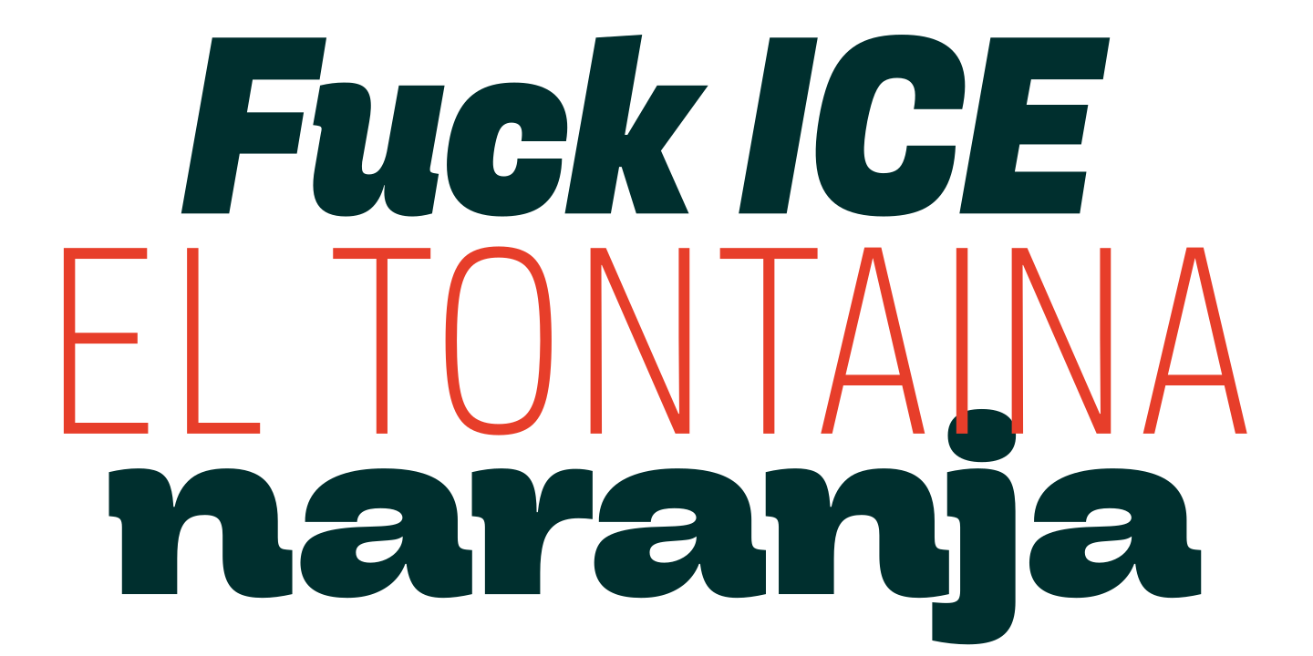
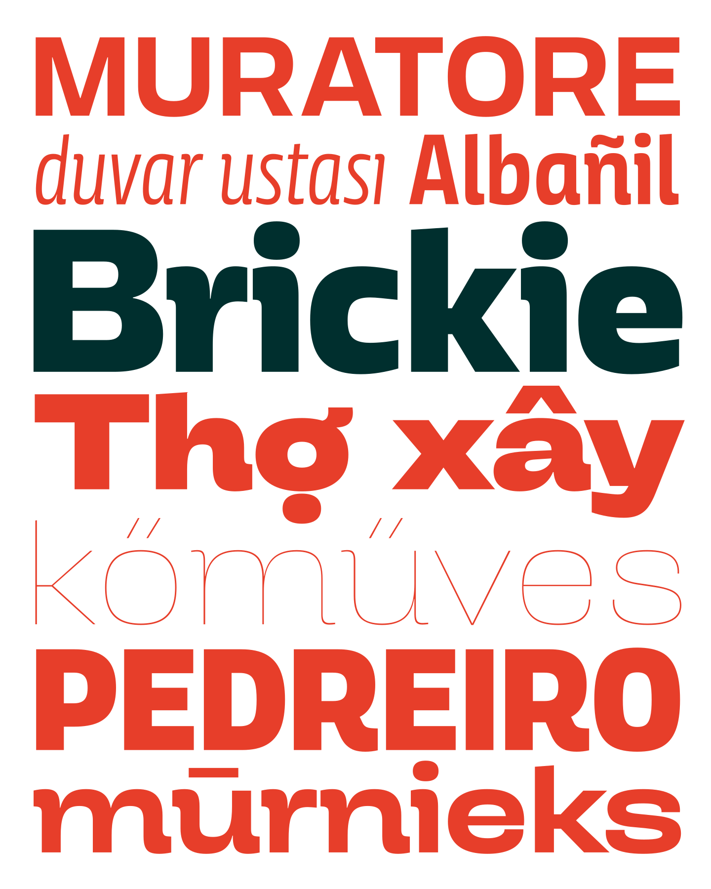
Brickie is a semi-serif family designed to offer a variety of widths and weights, aiming to create the boldest posters in extreme styles and the most legible text in the regular zone of the family
It’s interesting how redesigning the foundry website leads to designing new typefaces. When you create new visuals for the web, you realize that some of the older typefaces no longer keep up with the new ones. Sometimes it’s best to let them go and let them live out their lives elsewhere, but there are designs that—whether out of affection or because they have potential for improvement—deserve a second life. That’s how I redesigned Ultramarina, for example.
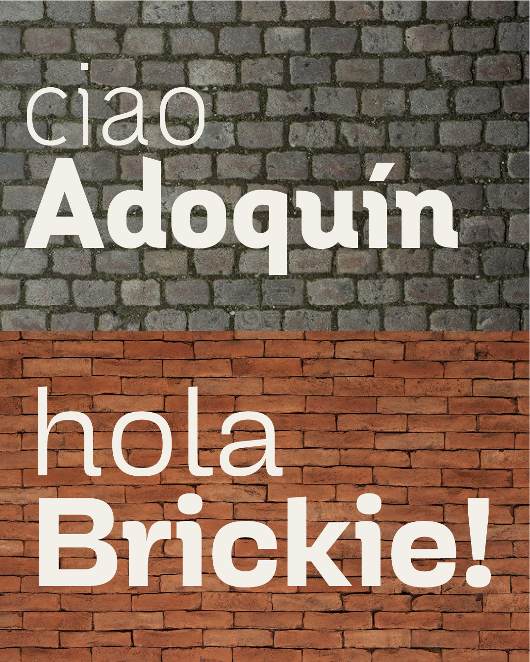
During the site’s latest redesign, Adoquín was the one that got the axe. It was my first comprehensive typeface family, designed almost entirely on my own, and full of absurd and original ideas that, years later, make me cringe a little. When I took another look at it, it became clear to me that it needed a complete redesign from scratch; I still liked the concept, but the result could be better.
That’s how I got started with Brickie, which quickly got out of hand and took on a life of its own, drifting further and further away from Adoquín until it became a design with a personality all its own.
With a grotesque look, but the ability to switch to a humanist style via the OpenType menu, Brickie is available in so many widths and weights that I can’t think of a single place where it wouldn’t fit perfectly. As long as you like quirky semi-serifs, of course.